| Entrance | Mainstreet | Wiki | Register |
|
# of watchers: 38
| D20: 2 |
| Wiki-page rating |  Stumble! Stumble! |
| Informative: | 0 |
| Artistic: | 0 |
| Funny-rating: | 0 |
| Friendly: | 0 |


| Main Street - News - Main Street Poll - Daily Poem - Featured Story - Featured Art - Featured Member - Featured Wiki | Your House -profile -diary/blog/jo -guestbook -poll -statistics | Messages -Wheeee! x new messages! -inbox -outbox - view unread messages | Notes - Friend list? - the list of wikis you're watching/ownin - List of houses you're watching - List of forums you'rer a member of (should take you to the page where you can edit forum prios, etc.) - possibly a link to help page? | Forums - Forum replies - list of forums - more stuff... need to think more about this part. | Wiki - Index - Wiki Help - Community (community index page) - Competitions? (maybe would go somewhere else better?) |
 [Triola]
2009-11-17 [Chel.]: I hope you don't mind me sticking up random notes.
2009-11-17 [Chel.]: Oh! I love the right boxes that he did! It looks all so unified and clean!
Not a fan of the left R2D2 column thing but the buttons look snazzy.
2009-11-19 [windowframe]: possibly something to think about with the roll-over effect: how will it work with the leaves at the top? (Or did you want to change that, too - either way, this might still be something to think about), Obviously, if the buttons are on the dark-green leaves, the text will need to be quite a light colour - but on smaller screens where people have a second or third row of buttons, those buttons would be on the much lighter ET background green, which would make those buttons hard to see if they were a light colour, too.
2009-11-19 [Hedda]: 1) New entrance image: I'll not prioritize this. I would love to have some small images here and there where they fit though. Like on the list friends pages and such.
There is a lot of things to do with putting buttons in better groups and making them easier to see and be less in the way. But the strategy there is to change one place at a time!
The graphical buttons are a problem, and I'll try to fix so that they can be changed from the stylesheet.
2009-11-19 [Kaimee]: *Pats hedda* no hurry :P
I think perhaps a new contest (when all the seasonal contests die down) for new entrance art, with a crew poll and elftown poll deciding which we all like the best is the best idea for that, so we can get as many contributions as possible.
And if no one contributes one we really want on the entrance, we do a short rotation for a month or two and then take them down :P
2009-11-19 [Chel.]: *nod nod nod* A wonderful idea!
2009-11-20 [Hedda]: There is a huge problem with rotating: I want people to recognize the frontpage and it appears in ads and such too.
2009-11-21 [Kaimee]: Hmm, I was thinking only use rotating images for a week or so as a "prize", and if one of them was what we were after it could be used permanently.
2009-11-29 [windowframe]: Putting aside the Front page image issue for a while, let's talk about the leaves. :D
You both want the top and side-borders to match, so - ideas? Do you want the sides to match with the current top border, or the top and RHS to match with the LHS border, or want to redesign all three? I really like the RHS border on Kaimee's stylesheet, but I think the overall effect is quite Christmassy, also, the little lights wouldn't show up without changing the light green background...
2009-11-29 [Kaimee]: Hmm, I was just messing about with different type of graphics to fit that 7px area nicely, I'm sure I (or others?) could come up with darker graphics to work with the lighter background.
That said, if updating the look of elftown one of the first things I would do would be to unify all the green tones to a more neutral heathery green in lights and darks, rather than this assortments of apple, lime, and forest. So the pale green background would ideally be a bit darker, and slightly less saturated a colour.
That's just my personal choice, and I've been messing around with different green tones, so I'll put up some examples sometime so you can see what I mean.
2009-11-29 [windowframe]: Awesome. :)
2009-12-04 [windowframe]: Just a thought that occurred from looking at True's mock-up again: we could always just get rid of the little pixel-y leaves down the RHS altogether, and not replace them with anything. <_<
2009-12-05 [Chel.]: I suppose... what about just a thick bar or something? I mean, I think people pay more attention to the leaves on the left. Frankly, I wonder if anyone would notice if you took it down completely.
2009-12-05 [Kaimee]: I'd really like to be able to set up a design that relied on the navigation for decoration, and didn't have repeating borders everywhere >.>
2009-12-06 [windowframe]: http://www.cad
^ I like how he does his news-posts. Main Street would look a lot nicer if news & features looked more like that. <_<
2009-12-06 [Chel.]: What do you guys think about the buttons on the top bar? I'm curious if people recognize the images on the buttons or what the buttons actually say...
Point is: What if we make the buttons all sleek and new looking. Like the "Bookmark" and "Refresh" buttons on the upper right.
2009-12-06 [Chel.]: Or maybe even...organiz
I dont know the technical issues about this, just suggesting.
2009-12-08 [windowframe]: I wouldn't mind changing the top buttons. <_< I know Kaimee had some roll-over idea in mind for them. I'm not a huge fan of the green buttons because so many of them are cut off along their bottom and right edges. I wouldn't mind seeing the leaves at the top changed either, at the moment on my browser, the border doesn't look like it's big enough to hold the buttons - the buttons overlap the edge of the border, and it doesn't look great.
2009-12-08 [Chel.]: I'm not a pro at the coding of stuff like this, but I thought of this:
You know the top under graphic of leaves? What if we recreated this but with buttons on the leaves? Idk...juts a silly thought.
2009-12-08 [NOOOPE]: I was wondering... I think the random members pics take up a lot of room. Do any of you remember how elfwood had a simple box that would slide show new submissions? I have no idea if the coding for elftown can do that, but it would be neat. People would be excited to see themselves. And what about a shout box? If we can clear enough off of mainstreet we can make it more interactive and fun to visit.
2009-12-08 [Chel.]: And why exactly does the mainstreet go down so far?! M and I were discussing this...
It's cluttered and repeats itself over and over! Do we NEED a lift on contests on the left side? Can't we have one box with a link to them OR have a box that rotates through the official/activ
2009-12-08 [NOOOPE]: I was just thinking about it rotating and a "see more" button. Chel-chan... get out of my brain.
2009-12-08 [Chel.]: It's cozy...
2009-12-09 [NOOOPE]: And pretty hot once the guy on guy action turns on. Which is, uh, quite frequently, actually.
2009-12-09 [NOOOPE]: Here's some Things on Mainstreet that pester me which I feel need changing.
2009-12-09 [Chel.]: M AND I MADE A DISCOVERY.
ELFWOOD HAS DROP DOWN MENUS
Why the hell don't we have that too?! It would eliminate the entire side bar into a nice condensed tool on the top.
2009-12-09 [NOOOPE]: Heheh... Ok.
http://www.elf
I feel that a menu across the top that drops down could really condense and simplify everything. It could also give people more options. You could literally eliminate the side boxes by fitting everything neatly into sexy, well labeled drop downs. You could knock off the buttons and even some guide wikis (like the wiki wiki) by simply taking advantage of this feature. It's so simple! Joy!
Before anyone knocks drop downs... deviant art has drop downs. Facebook has drop downs. Tons of professional sites have drop downs. We aught to emulate them. They know what they're doing.
Also, like I stated before, the slide show thing elfwood can do... Can we do that? Wait! YES. YES WE CAN. The mainstreet image. It rotates. Can we show random active members with the same kinda dealio?
The constantly updating online members thing is cool too.
Ya see, it's hard to know what to suggest, when you don't know what can be done.
2009-12-09 [NOOOPE]: Ok. So Chel-chan and I have been going through possibilities, and have come up with a very rough concept. We feel a tree would go with the nature theme and the leaf motif (hurhur). However, we would like to understand a few things. Neither of us can code, so forgive our ignorance.
L'image: 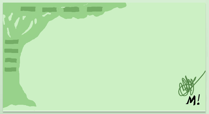
We put the tree on the left making these assumptions: The tree would be a back element, like the leaves on the top. It will sit behind the buttons and alerts. However, I was concerned that an element like that would not be able to work on the right and slide with the alerts when the window is manipulated. I based this on the observation that the leaves on the right are a top element like the boxes, which is why they slide around (I hope I'm making sense here). Because of this, we thought that putting the tree on the left stable side might be the only solution. Were these assumptions correct? Would it work on the right? (We like it on the right)
Also, with the drop down menu, it would be one long strip, I'm assuming. With buttons, they can jump and reorganize themselves depending on the window's size. A drop down thing would remain constant. I think if it were to be forever centered and of a decent size, that wouldn't be a problem, but, if I'm right, that would mean the menu wouldn't allow people to shrink their window passed a certain size. I believe, however, this can be dealt with successfully (drop downs = superior btw).
2009-12-09 [Kaimee]: OK, too many replies and I'm tired and cranky after work:
1. Yes of course Elfwood has drop downs you degenerates, how long did it take you to notice this? :P This is partially what inspired me to become serious about updating the layout here, aside from the fact that Elftown needs a functional navigational system capable of handling a huge amount of links, so we don't have index page problems such as we've been discussing recently ;)
The days of static single buttons are long gone, except for brochure websites that need to make up content to look full.
2. For mainstreet photos: It would be easy to insert a simple jQuery type code slideshow, I'm not sure what elfwood uses but jQuery is simplified java, easy to install, easy to use and update, and fast to load. See an example of one I used recently on http://www.jkc
3. Side boxes could be reduced, but the content should not be integrated into a dropdown menu where it isn't immediately viewable. Users expect things like new messages, new forum posts, new replies to wikis etc to be immediately visible. You could present this information in another format, another area, whatever, but they shouldn't need to access a drop down box to see this.
If anything, it's most common for a horizontal dropdown navigation system at the top of the page, with new messages etc directly below or above (depending on how site logo/title/her
4: Ok kids, hate to break it to you, but if we're looking to update the site we need to update it not tread further back into the recesses of web 1.0 where graphical navigations based on images were de rigueur :P
Navigations should be plain, without confusion or any unnecessary elements, be 'decorated' invisibly to give the impression of contemporary, slick graphics without ever drawing attention to the fact.
RELATED ALSO TO THIS..
4.a: Graphical borders should fuck off. Full stop. As crew members will have noticed with the index discussion there's been drama over browser sizes, keeping design accessible to different sizes and resolutions.
THIS IS EASILY SOLVED IN MOST CONTEMPORARY WEBSITES QUITE SIMPLY. Look around. Go to Apple.com, or go to the site I posted earlier. Open some random pages, for god's sake go to facebook. Now click the bottom corner of your browser and resize it. The websites will remain centered no matter how big the window is. This works with sites that have plain or graphical background colours/images
But what it means is that the left "edge" of your site will often not be created to sit flush with the left edges of your browser, to allow this resizing to happen with the site remaining centered. Because of this, graphical borders would look strange, unless done well and for a design purpose, such as you can see on www.designspon
5. Speaking of lace, if graphical borders are used, can we not think of anything besdies leaves? Think outside the box. Paper, lace, materials, such as seen on design sponge are a good example of modern and well-designed repeatable patterns, unlike the current pixel-leaves and mismatched other leaves.
There is no point in these extra decorative borders if they do not integrate into the site's look and feel seamlessly. So we come up with a look and feel that integrates.
6. Chel and M, if you guys are keen to help but are unfamiliar with webdesign, do what I said earlier and just open up good sites to look at: apple.com, facebook, elfwood (for common subject references), deviantart etc. Just look. Try and take notice of how they've done things, overall design elements, background images, whether the content floats in the center, whether they're using vertical or horizontal navigations, what happens when you hover over the buttons, etc etc.
Most of these websites will be very similar to each other in general, floating content, plain or neutral background, simple navigation using usually both rollovers (changes when you hover) and dropdowns.
Try coming up with thumbnail concepts after this plotting out where each important element would go: message notifications, navigation, log in, etc. It's no use coming up with pretty things if we can update to a more efficient layout in the first place.
2009-12-09 [Chel.]: ...."Degenerat
We admitted that we don't know much about how the coding works, but we are TRYING to help.
About 5... Hedda didn't seem to keen on the change to begin with so we tried to think of a way to integrate what is already here. Personally, I think this place needs a total clean swipe...but I was trying to be a little more realistic with what HE would appeal to.
2009-12-09 [NOOOPE]: It was a rough idea... and as chel stated, Hedda wants to preserve what he considers "trademark elftown" so, in accordance with his wishes, we thought a tree was a unifying, attractive compromise.
And we did go to other sites... geez. That's how we got all our ideas. I warned you we're totally ignorant on the subject and just wanted some guidance. No need to be explosive. We were just tossing around ideas... which is what this page is meant for. No need to condescendingl
And chel-chan and I never go to elfwood, so it was a nice surprise for us. Again, why are you insulting us? Calm down please?
In conclusion... this page is to discus redesigning. You should be appreciative that we're TRYING at least. Geez... *Offers stress doll*
2009-12-09 [windowframe]: Don't take her so seriously guys, I'm sure she didn't mean it to be taken so. :)
About using something other than leaves: cool, but shouldn't it still be something that fits in thematically with ET? Lace fits in with designsponge's content pretty well, less so for ET. :P So what would fit well for a fantasy & sci-fi site? At the moment, ET is far heavier om the fantasy front than the sci-front. Do we want something that would give them a slightly more equal consideration?
2009-12-09 [Chel.]: I vote for that! I'm a sci-fi nut myself....
2009-12-09 [windowframe]: So what looks sleek, and appeals to sci-fi fans just as much as fantasy fans? <_< (though it's not really surprising we have more fantasy fans than sci-fi fans here, considering the name of the site and the fact that all the front-page images are fantasy, not sci-fi).
2009-12-09 [Chel.]: Oh jeez... Hmm...
I think with something like that we would have to stay away from recognizable objects. What about just graphic bars and colors?
It's a bit boring but it can apply to anything.
2009-12-09 [windowframe]: Also, I agree about the borders to the left, right and top needing to go. So, [Kaimee], do you have a moment to work on new buttons for the top nav anytime soon? and possibly a suggestion for a new background colour for ET, since I presume you'll be designing the buttons to go with the new background colour rather than the current one.
2009-12-09 [Chel.]: I would love a new color too...but I think Hedda already said that the green is what set ET apart from other sites. :/
So I thought a new color would be out of the question? Not to mention...Entr
2009-12-09 [windowframe]: We can change the tone of it, though. Make it a slightly darker green or more grey-ish. Or we could possibly change the background colour, but keep lots of other things green - colour actually make the green stand out even more.
2009-12-09 [Chel.]: I get how ET is mainly green and that's fine. But what about an accent color? Adding a color that isn't green. But blue or...grey or even brown?
I'm just ranting :P
2009-12-09 [windowframe]: I hafta say I've been thinking of brown too - maybe something like the grey floor-board design from Kaimee's stylesheet up thar, but with.. wood coloured wood instead. :P
2009-12-09 [Chel.]: Yea..I like that too! It stays far enough in the background and is really elegant.
Thing I have with it is...would it be more difficult to create a wiki with image text, graphics or specific themes(like a front page for a roleplay or something)?
Personally I like the flat color. If anything, maybe liiiiiight gradient only at the top/bottom? I usually hate gradients...th
2009-12-09 [windowframe]: :O I hadn't thought about what wiki's look like. Maybe the content could be in a presentation style box? Or is that a really bad idea?
2009-12-09 [Chel.]: Style box? It's too bad users cant customize individual wikis. Imagine all the fun THAT could be. :3
2009-12-09 [windowframe]: elftown.heddat
Just playing around - sorry Kaimee, I yoinked your wood and tampered with the hue and saturation. D: Please forgive me.
2009-12-10 [Chel.]: What the hell do I do with that? O_O'
2009-12-10 [windowframe]: *accidentally deleted her own comment* -_- Geeze, I'm on the ball today.
You copy the line I pasted, go to your house, edit, and dump it in the box for stylesheets.
2009-12-10 [Chel.]: .....Yea I'm not doing something right.
2009-12-10 [Chel.]: Woaaahh....coo
2009-12-10 [Chel.]: I would go a smidgen lighter..
2009-12-10 [windowframe]: I was thinking possibly a little greyer too, I'll play around with it this evening. Also, we can change how the message scroll looks in the stylesheet, so if you have any ideas for a shiny new message box, we could plug that in, too.
2009-12-10 [windowframe]: Also, it's very probably just me being a sucker of a magpie for bright shiny things, but I think this page: EG Zodiac Symbols 2 looks awesome with this stylesheet. <_<
2009-12-11 [Kaimee]: OK *kids* (I call my parents kids, don't take me so personally :P) I understand you have little to no web experience, which is why I'm telling you to look at other sites. You've done well looking at elfwood/dA etc, but look at more. And more. And more. I'm going to be looking at them too. You do endless amounts of research for something like this. I'm not trying to patronise you or fight with you, I'm just tired and generally quite blunt.
So if you think that was aggressive and insulting, just imagine it all in an extremely tired voice, that should help :P
If you want to be involved in any type of collaborative creative venture, it will be easier if you do not take any rebuttals or edits to your suggestions personally, as they're aimed at the suggestions, not at you.
The Wood:
I've been using this dark grey wood tone for a couple weeks, and I think if we use the wood at all we will have to give it less depth of texture levels (as it is, the contrast between the dark and light wood grain makes it hard to read text behind it) and also lighten it to a pale grey.
For other colours in the wood, a very low saturation greyish brown would probably work, but when you get into a brightly coloured background (eg the light brown) it seems to get harder to read wiki text on. Perhaps a mossy green/grey wood? Obviously wood doesn't come in that colour usually, but hell, we're elftown. We hardly need to be literal :P If SilverFire can desaturate her brown wood as well we can see how it works with the text.
Accent colours and The Green
We can keep the green (or a unified version of the green) without necessarily having it everywhere :P Since I've started messing about with this I've actually talked to a bunch of different people who have been embarrassed to open this site at work, in the library, at school etc etc because of the bright green and pixel leaves everywhere. They're all used to more neutral modern sites (think facebook) that may have a main colour, but the entire screen isn't necessarily covered in it.
Perhaps a more neutral accent as you guys suggested (or a well publicised option of easy-to-use neutral style sheet of the new version) is the way to go, bringing the green in on primary areas (headings, special images etc).
Personally, I lean towards a golden brown colour (see Herald banner above) as still being quite fantasy, yet not the sickly green colour.
Buttons
I'll have a go at getting a nav concept up, I'm just being hindered by work. I'm ending a fulltime temp contract and taking up an overlapping fulltime position this week and getting work finished at one, started at the other, and sanity preserved in between has been difficult.
I'll do 2 concepts up, one for the nav I already had in mind, and one adapted for drop downs.
Magpie for Bright Shiny Things:
I know, how cool does everything look on the wood? I was actually looking at that wiki the other day >.>
2009-12-11 [Kaimee]: PS. Tip No.1 in the Handy Guide to Kaimee.... If I add a :P or a ;) after what I've said to you, I'm joking. If I add a :) there's a high chance I'm trying to anger or patronise you, or simply that I in no way respect you but want you to shutup. The sentiments could be exactly the same, but if you get the magical jokey faces please try not to take what I've said in an offensive way :P
2009-12-11 [hanhepi]: damn, that guide to Kaimee tip made me want to go search my messages from you, to see how often you used :) on me. :P
2009-12-12 [Kaimee]: you mainly rate :P I sometimes use :) as pure sarcasm though, not really related to people personally.
2009-12-12 [hanhepi]: look at you backpedal. that's so cute. :P
on a more serious note: i like True's workup. it still has a soft green and leaves thing going on, but it has a more polished look to it.
the soft green is important i think, because a white background (like facebook) is so harsh on the eyes. i can be on here for literally 8 hours and get no headache or eyestrain, while i get about 45 minutes on a white page before my eyes want to pop out of my head or burst into flames.
and i mean colors effect mood, so we want to steer away from colors that would create negative moods and hostility (like red). green is a good calming color. can yo imagine what the drama here would be like on a red background?? (on the other hand, i guess red would hide the bloodstains pretty well.)
2009-12-16 [windowframe]: omfg, I use them almost the other way around. I use winks to patronise usually, but never non-winkies. :O Will play around with desaturated wood tomorrow.
There are a lot of sies (facebook, ctrl+alt+del) that just have a plain white background and they all look very sleek. But every time I try and imagine ET with a plain white background, it just looks pants in my head. >:/ *fails at imagination*
2009-12-16 [hanhepi]: *note to self*: kaimee regular smiley = patronizing, silvie wink = patronizing. good lord i'll never keep this straight.
2009-12-16 [windowframe]: Also, not to get too far off topic, but: I have a friend who got a great job the other day, and someone wrote on her Facebook profile congratulating her, she replied with a '>.<' which confused the hell out of me, so I asked her about it later. Apparently, she thinks '>.<' is '^_^'. How confusing is that? :P
2009-12-19 [windowframe]: Top nav stuff:


 (sorry they're so long/tall)
2009-12-20 [Chel.]: So sexy...
2009-12-20 [Chimes]: Have to agree.
2009-12-20 [Chimes]: I don't know if this has already been said... but as for entrance images... I think we should have special ones for Christmas time, halloween time, valentines... etc. :P Could make things more interesting.
2009-12-20 [Chel.]: Cool! I like that idea! But first... I think we need to warm Hedda up to the idea of getting rid of the current one.
2009-12-20 [Chimes]: Public vote? :P
2009-12-20 [Chel.]: I agree...
2009-12-20 [windowframe]: We did actually host one for a Christmas front-page image once. If the winner for that isn't too bad, we could always use that one at Christmas?
2009-12-20 [Chimes]: That could work... Do you know where the page is for it? *wants to have a nose*
2009-12-20 [windowframe]: Check Elftown Past Competitions. :)
2009-12-20 [Chimes]: Fankoo. :)
2009-12-21 [windowframe]: Because Hedda said the last one was too flat:


Unfortunately, this one doesn't really allow for the type of buttons Kaimee wanted - the ones that only appear when you hover over them.
2009-12-21 [Chel.]: Oh even sexier!
2009-12-21 [windowframe]: It would also be sort of cool if the menu that appears didn't just blink into existence but phased instead. I wouldshow you what I mean, but I can't remember what program it is I have to do that kind of thing. <_< How dopey can you be?
2009-12-22 [windowframe]: And possible button for everywhere else:
Since Kaimee said she wanted gold. <_< I *think* it goes with the green.
Or would it be better to have them in the same green as the top nav, and try to introduce the gold tones elsewhere?
2010-01-02 [windowframe]: 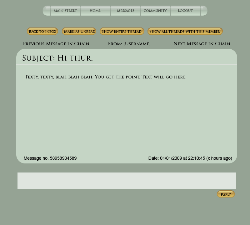
2010-01-02 [Chel.]: I think the "-in chain" portion isn't really needed. It sort of makes the text run long.
As for the gold buttons.... I'm not quite sure. Maybe there is too much contrast in them?
You did a great job making the layout though! :3
2010-01-02 [windowframe]: The 'next in chain' refers to that particular thread of messages, not just the next unread message you have. But I don't know why I wrote 'chain' instead of thread. But it needs to be distinguished from just the plain 'next message' option was the point anyway.
And I agree about the gold, I was wondering whether it made them stand out too much. I haven't tried to do anything with the side navigation yet though, so maybe if when I do that I add some gold tones there too, it will make the buttons stand out less...
Otherwise I'm not sure what to do with them, since I think we do need another colour other than green. <_<
2010-01-03 [windowframe]: 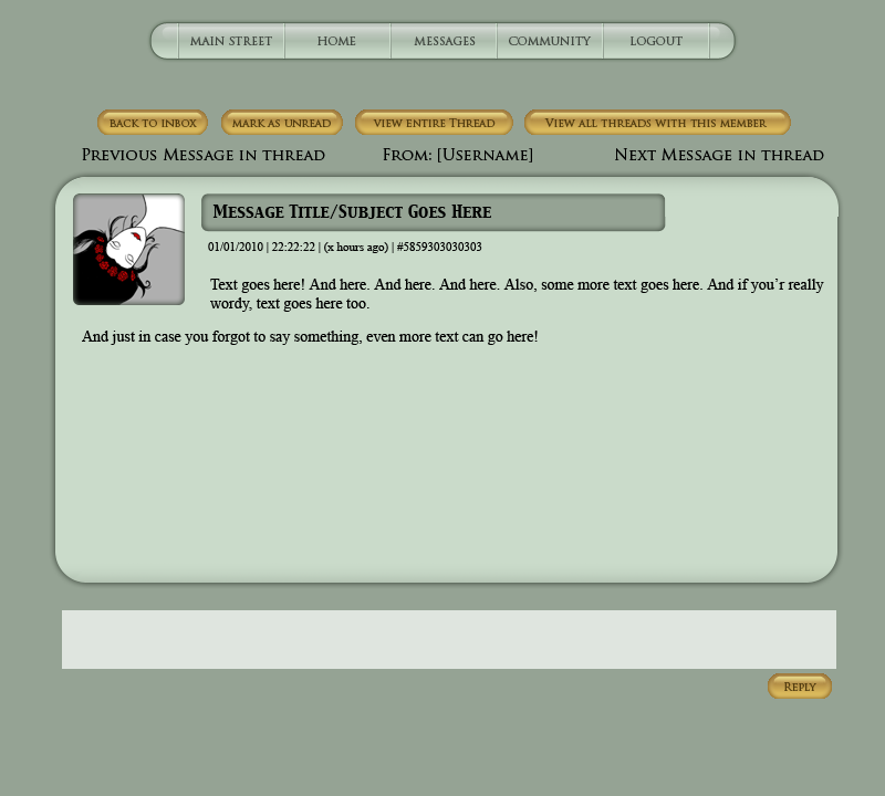
Take two.
2010-01-03 [Chel.]: Oh! I love the idea of a thumbnail!! Bloody brilliant!
2010-01-03 [Chimes]: Preeeetty! I'm liking this very much.
2010-01-03 [Chimes]: Definitely looks better with the shadowing. :)
2010-01-04 [Kaimee]: Whoa! Nice work! Sorry I've been away, I've been working every day since Dec 12th bar xmas and I'm starting to die x.X
While I like the gold colours in the colour scheme I was working with (greys, golds, and firefly "lights") It might be a little too bold against those heathery greens you're working with? You could perhaps try a very toned down mid-dark purple, or back the gold off towards a greyer shade? Not really sure...
Also, I would still like the chance to try adjusting the top nav buttons through the css, but otherwise as is. Hedda? Anything you can do about this? I could photoshop mockups but if you could make the button code accessible through css that would be best, because then I could get a chance to actually put something together that worked :)
If we can work on making smaller changes (for instance, adjust the sidebar graphically through css while leaving the same html structure etc etc) at first, I think there's more chance of things getting done ;)
Simply because it might be easier for Hedda to switch elements to css-editable, while we update them graphically, rather than overhauling the entire site's code... if this makes sense?
2010-01-05 [windowframe]:
I thought about trying purple. IS that toned down enough? <_<
It looks better than the gold, anyway methinks.
2010-01-05 [Chimes]: I like the purple, but then I might be a bit biased. :P I have a slight purple obsession.
2010-01-05 [hanhepi]: i like the purple better than the gold.
2010-01-05 [windowframe]: Also, Just a note, I can't adjust the sidebar graphically how I would want to through the css, because apparently the css can't cope with rounded corners. <_<
2010-01-06 [Kaimee]: That's the sort of change I would like made to the html, so that we have slightly more control of the appearance through css, so that it could handle the corners.
If you work out what elements you would need to access through css to make the changes, perhaps you could broach making changes with hedda?
Also - definitely like the purple over gold, the gold only really works with the grey toned wood.
2010-01-08 [windowframe]: Talking to my boyfriend about how to make ET more user-friendly, especially for new users, he brought up the point that one of the things that helps keep people on a new site is if they make friends. Thinking about a site like gaia, it's pretty easy to make friends, because it's mainly forum based and you straight away meet a whole bunch of people there. How do people meet people on ET, and how can we make it easier for new people to meet other users?
2010-01-09 [Kaimee]: The community tab could have something like "random member", and link to an active member... except people don't like hi messages... Perhaps if everyone had a tick option in their house to decide if they wanted to be on a random member list (to receive msgs from new ppl), it would randomly select active people off there?
*is crap at ideas this morning*
2010-01-09 [windowframe]: I think one thing that would help would be to prune the wiki of dead pages. Places like Community list 90% dead places, which aren't going to be great places for new members to visit. ET's Wiki system grew with ET, it needs to shrink a bit with ET too. <_<
2010-01-09 [Kaimee]: Agreed! :D Make a list of things you think should be 'pruned'?
2010-01-09 [windowframe]: All of Community's sub-pages. The only problem with those is that there need to be some links left at the end. But I doubt any are active. <_<
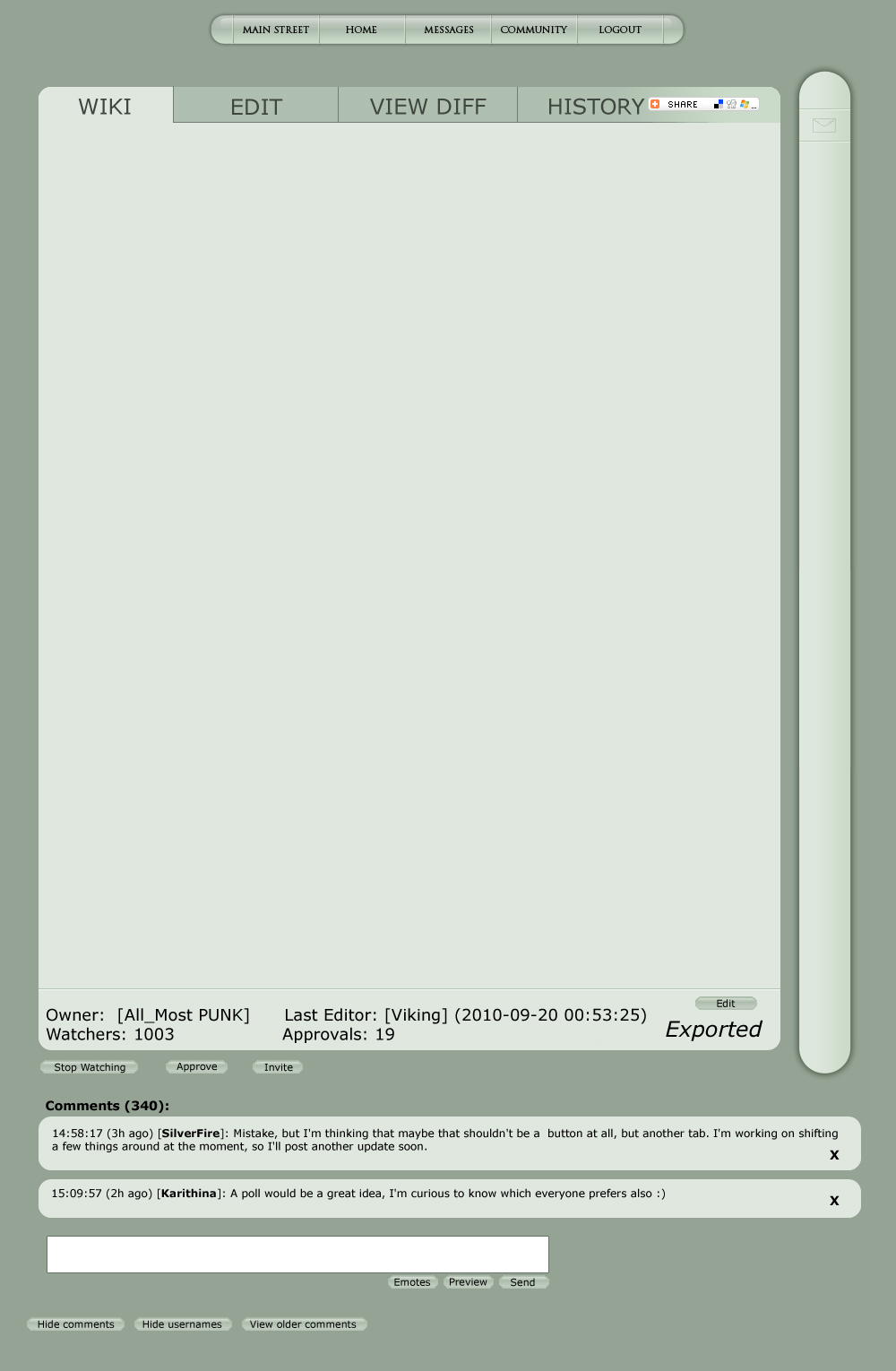
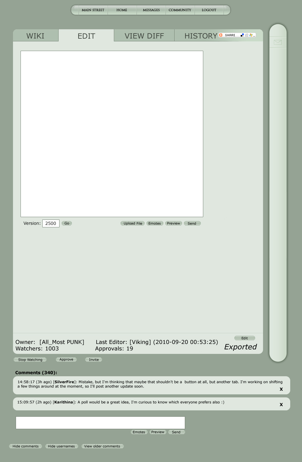
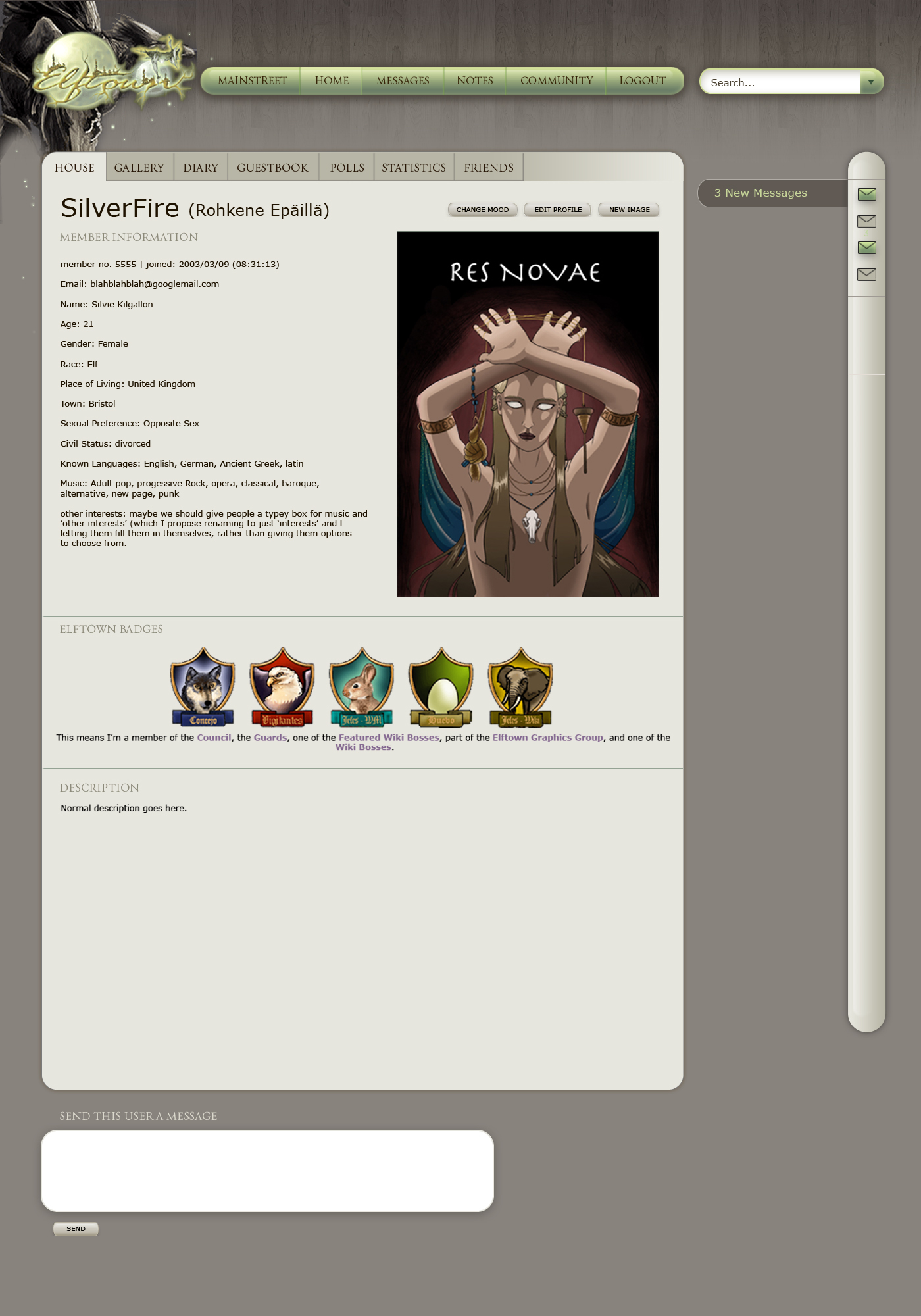
2010-01-11 [windowframe]: 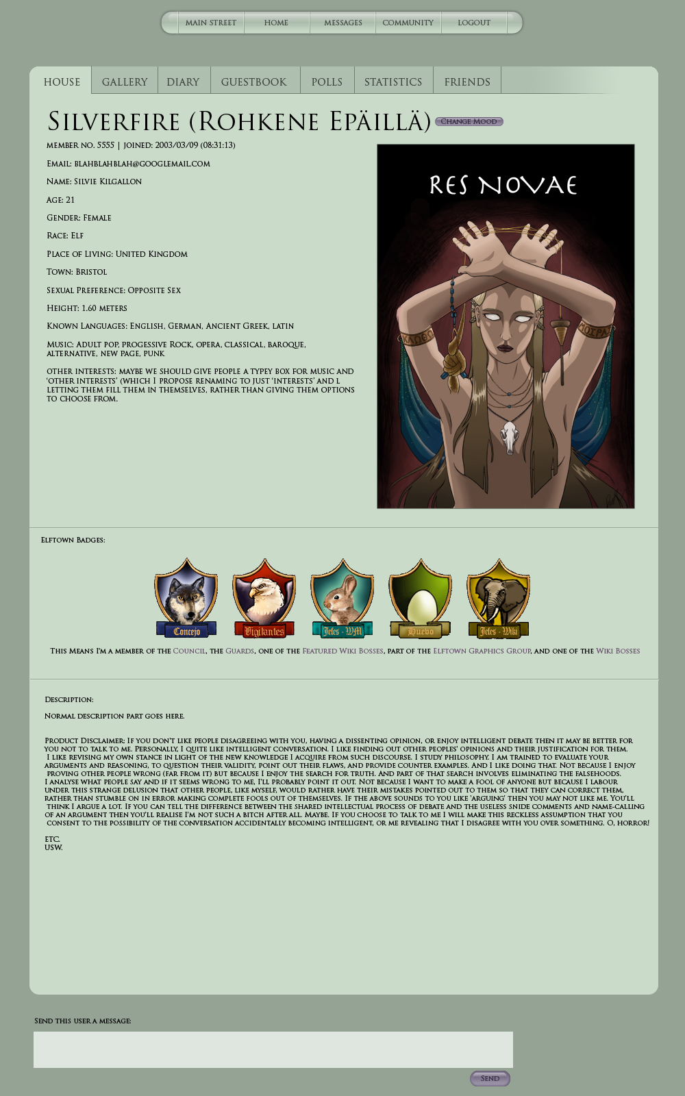 Does the whole thing (the profile box) need a drop shadow?
2010-01-11 [hanhepi]: if the messages get one, i'd say this one should get one as well.
would all bodies of text be in all capitals, or is this strictly for demonstration?
i like having a typey box for the music and other interests, that's a lot better than the check boxes that don't really include all the things people may like.
2010-01-11 [windowframe]: Just because the font I'm using only does capitals, and I'm only using that font because it happened to be the one already selected when I opened Photoshop, and I didn't bother to change it. :P
2010-01-11 [hanhepi]: Ah! well, it is a pretty font. :) i'm glad we won't necessarily be screaming our descriptions out though.
2010-01-12 [Chel.]: Hey! If you still want the gold in it, what if that is the color for new messages/new forum notifications?
Just a thought.
2010-01-12 [windowframe]: I was going to use a purply colour. Like the one on the _boring.css stylesheet.
2010-01-12 [Kaimee]: Haha, my brain isn't working, just tried to click inside the "send this user a message" box in your image to reply :P
Like it, but so green, and plain. Would this type of layout include any sort of background/hea
I think there does need to be some kind of graphical element, although this layout would work very nicely with other style sheets (grey wood! :P)
Actually, you wanna send me the psd/ai file (whatever you're working in) and I can try it with greys and wood tones? xD
Also, the photo seems limited to a portrait format to fit with that text, any other options for arranging it?
2010-01-12 [windowframe]: No, but I did include a drop shadow and a slight gradient at the bottom of the box now to give it some more interest.
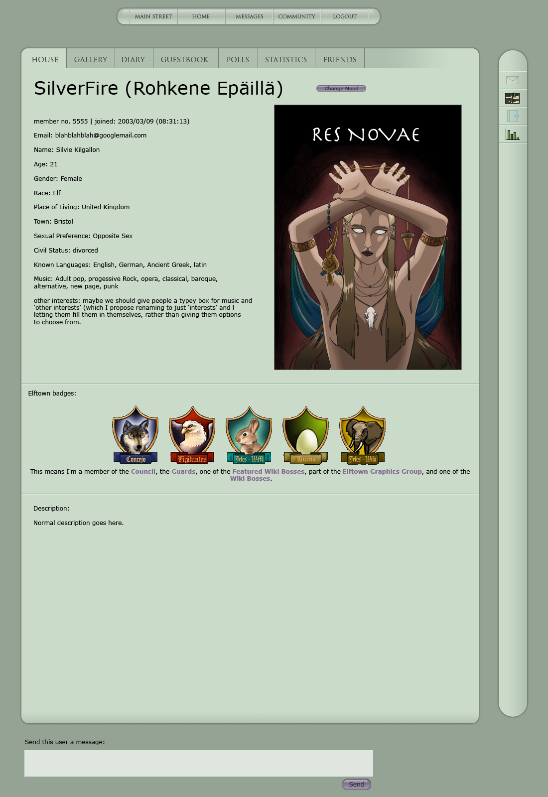
And no, I'd only really thought about sticking a portrait format picture in there (or a square).
2010-01-12 [Kaimee]: Hmm, maybe they get the tick box option to arrange their profile landscape or portrait, and it actually adjusts the format?
(Landscape photos would go underneath, rather than at the side, and the text could adjust to two shorter columns?)
Also really like the darker gradient on the unused tabs, would they have the same hover effects as you had for the menu (glow around the type)?
2010-01-12 [windowframe]: I was thinking so (for the hover over effect). I'll try a landscape picture and see what that looks like.
2010-02-05 [windowframe]: So, Main Street: A lot of sites seem to have their main page as just as a blog-like news feed, listing the latest 5 news items or so. Maybe we could try something like that with Elftown, and have the features either on a separate page altogether, or give each their own page.
2010-02-09 [Kaimee]: I think we need to compile a list of necessary things that should go on mainstreet, and design it around those. I spend my days dealing with websites that want 90 million pieces of information on the home page: no one needs that!
Quick-links to take you to half of these things on other pages would be enough for most, with a news feed (possibly with small thumbnails) that can mention new updates, featured art/poetry/etc
Statistics, worldmap etc can go on their own page, although I would say the polls are probably going to have to stay, simply to get enough attention.
2010-02-24 [Kaimee]: Hiya, just wondering where we're up to with this, any new designs?
So many little improvements and informative newsposts recently, exciting times xD
SilverFire, I can't remember, did you ever get me that psd/ai file? I'd really like to have a go at the layout and it's silly to mock one up from scratch if you already have a template :)
Of course, I might be a lazy bitch and avoid it for a little while because this is what I spend all day doing at work and it kinda eats my soul after awhile >.>
2010-02-24 [windowframe]: I posted a new side-bar design in the suggestions forum, and forgot to post it here, I'll go find it.
And, no, I didn't I needed to clean the file up first (so many layers floating around <_<) and kept putting that off and then forgot all about it. *fail*
2010-02-24 [windowframe]: Bit of a page-stretcher
 I'm being very lazy at the moment and can't be bothered to make several different versions of this, so you'll have to bear with some explanation (and an image that's a bit too big, because I can't be bothered to shrink it) . The idea is that if the icon is lit up, then you have a new message, guestbook, diary or poll notification (obviously wiki changes & comments will be there too, but I can't figure out icons for those, yet) if it's not lit up, then you don't have a new message, gb, etc. (but clicking on the icons should still take you to your inbox, guestbook, own diary, etc)
Furthermore, hovering over the icon when you DO have a new message or diary, wikicomment/ch
Other icons that might go there: one for friends (lit up means you have friends online, unlit, no friends, hovering would bring up the list of online friends),
A calendar icon (which when hovered over would show upcoming birthdays and perhaps official contest deadlines too)
possibly the featured art/poetry/wik
- the news (which can't be unsubscribed from)
Things that wouldn't go there: Last visitors list (it can go bye-bye <_<)
Elftown Status & last logins (maybe show on Main Street only)
Search functions. Not quite sure where to stick them yet, other than not in the sidebar. maybe top right corner, with a drop-down menu where you can select whether you want the search to be in members, forums, or wikis.
sidebar in context with rest of suggested redesign:
2010-02-24 [Kaimee]: Very nice idea on refining the sidebar! Not a huge fan of the icons, maybe we could try more stylised ones in only green tones? (Same light green as bar when inactive, darker green like that polls icon when active)?
Don't worry about cleaning up layers, I have to deal with messy files all the time at work so I tend to organise them pretty quickly when I start. If you send it along to me, I can sort them out and send you an organised version back ;)
If it's too large to upload here go to http://www.jkc
2010-02-27 [windowframe]: Also: I'll be the first to admit I suck at icon making, so feel free to give them another go, but I don't think just having two separate green tones for when they're active/inactiv
2010-03-18 [Kaimee]: I haven't had time to tackle this yet, sorry! >.< Life has been SUPERfun.
I'm considering also putting together a completely different layout just for funzies (I'm feeling sarcastic ok? :P) to see how elftown feels in crazy upsidedown world land.
Did we come to any conclusion on what things were a priority for mainstreet?
2010-03-18 [windowframe]: The news. :P And then maybe the features. Possibly the calendar at the same, but that's it.
2010-03-19 [Kaimee]:
Posted in suggestions, I'll stick it here as well. Have been messing with your super cool layouts trying to work some texture and varied colours into them (also, I just love wood backgrounds >.>)...2010-03-19 [Kaimee]: Hell, I already got carried away and began putting together a simple html/css cutup of this layout together to see how the rollovers were working xD
If this gets shot down majorly I am totally making a prettier Herald this issue :P
2010-03-19 [Kaimee]: Oooh ooh! (again, getting carried away, third comment >.>) How cool would it be if the graphic were a really gnarled, curvy, monotone bonsai, growing around a green toned elftown logo?
As in, we actually design a logo that has two parts:
1. graphic element combined
2. standalone logo section
The standalone would be useful used small, and the full image could be used on the entry page (very simple, it on a plain background), the header-navigat
I just got super keen.
I want a competition for this.
But I also want to win the competition myself :P
But mainly I just want it to look cool.
Hell, we could refine an updated version of an ET logo, and the competition could be to combine the new logo with monotone graphics for use on the website, eg someone could do a bonsai growing around it, someone could do a dragon gripping it, an elf leaning over it, etc etc. And the images would cycle through a couple months, and then the winner would be permanent.
It would also be a very cohesive design element clearly demonstrating how freakin awesome elftowner's are creatively :P We've gotten a lot of flak over the years from 'prettier' creative sites. I've personally chafed at the ugly elftown we know and love. I would just really really love to see some amazing graphics taking the forefront.
I'm going to stop being such a crack smoker and go to bed. Be gentle with my ideas xD
2010-03-19 [Sunrose]: Spastic..
2010-03-19 [Kaimee]: D:
2010-03-19 [windowframe]: How well does plain black text show up against the wood in the third one? It looks like it should be pretty fine to me, but it'd be good to see a sample just to be sure. Also, the bonsai idea sounds good to me.
Personally, I think we should just get rid of the entrance page altogether though, and have it go straight to Main Street (once we've de-cluttered it, of course).
2010-03-19 [Kaimee]: 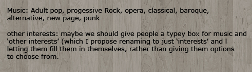
I'm using one about 5 shades darker, and straight grey, and text looks fine on it.
This example has small text, that would also normally have bigger line-spacing online, but that gives you an idea of the contrast.
Yes, I agree with that too actually :P We can easily define what content and links is available only to logged in members, and maybe more people will join if they can actually see it looking cool and active before they have to apply to become members :P
Speaking of, you've been doing a lot of rejigging of the applications page, I have design ideas specifically for that also >.> But a bonsai/logo would really
help me along with mocking that up xD
I think it's time to let my cintiq out of it's box tomorrow to have a play :P
2010-03-19 [Chel.]: I like the light green ones more! I love it! THIS NEEDS TO BLOODY HAPPEN. I love how you use the accent colors!
Although with that logo... I have no idea what the hell it is. It's like a crow...dragon thing on a log with a moon plastered over it?
2010-03-20 [Kaimee]: Excellent! Yeah, I am very keen to see a real redesign, rather than just restyling the current design. I already have restyled it for myself, and it's still an absolute shitfight trying to sort through all the extra crap.
Hahaha read the incredible amount of words and you'll understand :P
That isn't the logo, that's a crappy screenshot from the old elfwood layout that had the right toned illustration, WITH one of the better logos from elftown logos on top.
What I would love to see is a redesigned logo, preferably with some bright circle/moon graphic similar to this one and overall green tones, and then (and I was thinking to hold a competition of this, or invite all the best artists to participate, or some such) a series of different monochromatic illustrations around that brighter logo.
For example, a gnarled bonsai twisted around the green logo, a dragon gripping the logo, crow wings sheltering the logo etc etc.
2010-03-20 [Kaimee]: Also, couldn't be fucked making vectors, but for icons I was thinking:
All active buttons in green, all inactive in desaturated brown.
Section 1:
- Messages: envelope
- News: golden exclamation! mark: cannot be unsubscribed from, only different active button colour.
- Featured Art: paint brush
- Featured Poem: pen
- Featured wiki: hand drawn W with crown
- Featured member: stylised 'portrait' plain round head and shoulders.
- New poll: bar chart graphic
(All features and polls can be unsubscribed from by unticking box in your profile data)
Section 2:
- Online friends: two blank portrait people, if that isn't too close to msn! - rollout will also have birthdays at end of friends list
- New Diaries: open book/notepad on an angle, blank pages - says "11 new diaries!" and then says each member with (5) number after their name.
- Member changes: desaturated blank portrait person with green edit pencil over them
- New image: frame around blank image
- Wiki changes: hand drawn W, this encompasses comments as well, the rollout box should say:
2010-03-20 [windowframe]: Would section 3 only appear on Main Street? Because really, I have rarely wanted to know most of that stuff, and I'm pretty sure I could cope with the extra click to get to Main Street for the occasional time that I do. <_<
2010-03-20 [Kaimee]: Perhaps it could be unsubscribed from? In fact, pretty much everything should be a subscribing option so your entire sidebar is customisable..
I for one really don't want to see that list of wikis I'm invited to :P
2010-03-21 [windowframe]: Perhaps not an unsubscribe but a 'delete all'. <_<
2010-03-21 [Chel.]: A have a suggestion about managing your "watching wikis"....
I hate to relate things to Deviantart all the time, but when one manages the artists they are watching, it's literally a list of names with check marks next to them. You can uncheck several at a time and choose to unwatch them. I think could be very beneficial in managing watching wikis.
Again, I fail at coding and wouldn't have the slightest clue on how to go about adding a feature like this. Just a thought....
Number of comments: 525
| Show these comments on your site |
|
Elftown - Wiki, forums, community and friendship.
|